
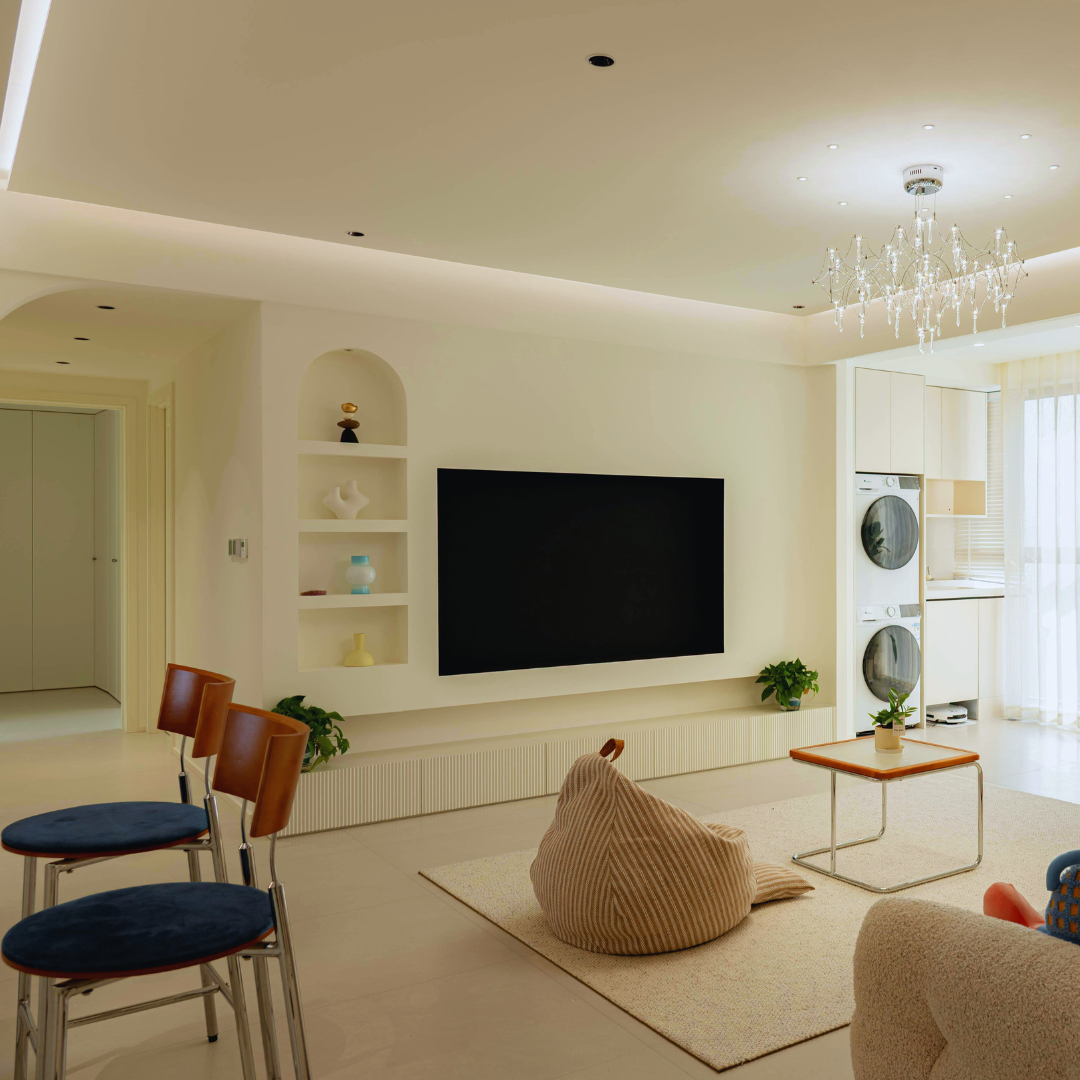
Small rooms can sometimes feel cramped and dark, but the right wall color can make a significant difference. Light and neutral shades like whites, soft grays, and pastels are the best wall colors for small rooms because they create an illusion of space and reflect more light.
Using cool tones such as pale blues and greens can also help the room feel more open and airy. Dark colors tend to make rooms feel smaller, so they are generally less suitable unless used strategically as accents.
Choosing the right color is key to maximizing your space’s potential without overwhelming it. This guide will explore practical options to help you brighten and enlarge your small room effortlessly.
How Wall Color Influences Perception of Space
Wall color directly affects how large or small a room feels by altering light reflection, depth perception, and mood. Certain hues and tones can make walls seem farther away or closer, changing how much space is visually available. The choice between warm, cool, intense, or muted colors plays a significant role in spatial perception.
Light Colors to Expand Small Rooms
Light colors such as whites, pastels, and light grays reflect more natural and artificial light, creating an airy atmosphere. This reflection increases the room’s brightness, making the walls feel less confining and the space more open.
Using colors like soft cream, pale blue, or mint green can trick the eye into seeing longer distances. Lighter tones also reduce harsh shadows, which can visually break up a room and make it appear smaller than it is. Floors and ceilings painted in these lighter shades contribute further to the sense of expansiveness.
Warm vs. Cool Tones Effects
Warm tones—such as soft yellows, peach, and light terracotta—tend to draw walls closer, making the room feel cozy but sometimes smaller. These colors stimulate a sense of intimacy but can reduce the perception of space when overused.
Cool tones—like light blues, greens, and lavenders—push walls visually away, generating a sense of openness. They often create a calming effect and add to spatial depth, which benefits small rooms looking to maximize perceived area.
Impact of Color Intensity
Strong, saturated colors tend to absorb more light and can make walls seem closer, which shrinks the perceived size of a room. For example, a bold red or deep navy might overwhelm a small room by reducing apparent space.
Muted or pastel versions of these colors reflect more light and maintain a softer presence. Choosing lower intensity colors balances personality with spatial expansion, preventing the room from feeling enclosed or cramped.
Top Wall Color Choices for Small Rooms
Choosing the right wall color can make a small room feel larger and more inviting. Lighter shades reflect more light, while certain neutrals and pastels add depth without overwhelming the space.
Classic Whites and Off-Whites
White and off-white tones are the most popular options for small rooms. These colors reflect natural and artificial light, brightening the space and creating an airy feel. Variations like cream or ivory add warmth without sacrificing the benefits of white.
Using crisp white can make edges and corners more defined, visually expanding the room. Off-whites, such as beige or pearl, soften the starkness of pure white and add subtle warmth. These shades also provide a clean backdrop that suits almost any decor style.
Soft Pastels for a Spacious Feel
Soft pastels offer a gentle splash of color while maintaining a light and open atmosphere. Colors like pale blue, mint green, and lavender introduce subtle personality without shrinking the room visually.
Pastels work well in rooms with good natural light, helping to reflect and diffuse it. They add a layer of calmness and softness that pure neutrals might lack. Because they are muted, pastels avoid overpowering small spaces, providing a fresh, airy feel.
Neutral Shades for Versatility
Neutrals such as taupe, light gray, and warm beige provide a flexible base for small rooms. These colors add depth compared to whites and pastels, but remain subtle enough not to overwhelm.
Light grays can create a modern, sophisticated look while taupes and beiges add warmth. Versatile and timeless, neutrals pair well with both bold accents and muted decor. They also hide minor imperfections better than pure white, making them practical for lived-in areas.
Using Dark and Bold Wall Colors in Small Spaces
Dark and bold colors can add depth and personality to small rooms when used thoughtfully. Strategic placement and complementary decorating choices help avoid overwhelming the space and maintain balance.
Choosing the Right Accent Wall
Choosing a single accent wall to paint in a dark or bold color is a practical method for small rooms. The wall behind a bed, sofa, or fireplace is a popular choice because it anchors the room visually.
When selecting the wall, consider natural light sources. A darker color on a wall receiving less light prevents the space from feeling cramped. Matte finishes reduce glare, which can make bold colors easier on the eyes.
Avoid painting every wall in a small space dark, as this can make the room feel smaller. Instead, one accent wall paired with lighter surrounding walls keeps the space from feeling closed in.
Pairing Dark Colors with Light Decor
Balancing dark walls with light-colored furnishings creates contrast that opens up the space visually. Use furniture in white, cream, or pastel shades to reflect light and soften the dark backdrop.
Incorporate metallic or glass accents to enhance light reflection. Bright textiles like rugs, curtains, and throw pillows in lighter tones break up dark expanses and add texture.
Lighting is crucial; multiple light sources, such as lamps and overhead fixtures, prevent dark walls from absorbing too much light. This approach maintains a vibrant and inviting atmosphere despite the bold wall color.
Color Combinations to Maximize Space
Using strategic color combinations can help create the illusion of a larger room. Choosing the right hues for walls, trim, and ceilings influences how much light reflects and how spacious the area feels.
Monochromatic Schemes
A monochromatic color scheme uses different shades, tints, and tones of a single color. This approach creates a seamless flow, reducing visual breaks that can make a space feel confined.
For small rooms, soft blues, grays, or beiges are common choices. Use the lightest shade on the ceiling and walls, with slightly darker shades on the trim or accent areas. This subtle contrast enhances depth without disrupting the overall openness.
Layering textures within the same color family can add interest without overwhelming the eye. Matte or eggshell finishes on walls paired with semi-gloss trim work well to reflect light differently while maintaining cohesiveness.
Contrasting Trim and Ceiling Colors
Using contrasting trim and ceiling colors against lighter walls can define architectural features and draw the eye upward.
Bright white or off-white ceilings paired with pale-colored walls push the ceiling visually higher. Darker trim colors, such as navy, charcoal, or forest green, create sharp outlines that frame the room.
This method works best when the wall color is neutral or pastel. The contrast adds dimension but preserves a sense of spaciousness by clearly separating the elements.
Avoid high-contrast walls and trims that are too bold, as this can close in the space rather than open it up. Moderate differences ensure the room feels well-proportioned.
Paint Finishes and Light Reflection
Choosing the right paint finish affects how light interacts with walls, influencing the perception of space. The sheen can enhance brightness, hide imperfections, or add subtle texture depending on the room lighting conditions.
Best Paint Sheens for Small Rooms
Flat or matte finishes absorb most light and reduce glare, but can make a room feel darker and smaller. They work well on ceilings or low-traffic walls where reflection is not needed.
Eggshell and satin sheens offer a soft glow and slight reflection. These finishes add depth without overwhelming shine and are easier to clean, making them suitable for small rooms.
Semi-gloss and gloss provide high reflectivity, bouncing more light around. However, they emphasize wall imperfections and can create hotspots in compact spaces, so use them selectively on trim or furniture.
| Sheen | Light Reflection | Durability | Best Use in Small Rooms |
| Flat/Matte | Low | Low | Ceilings, non-traffic walls |
| Eggshell | Moderate | Moderate | Main walls, balanced shine |
| Satin | Moderate-High | Moderate-High | Walls needing durability |
| Semi-Gloss | High | High | Trim, doors, accents |
| Gloss | Very High | Very High | Accents, highlighting features |
Enhancing Natural and Artificial Light
Natural light varies during the day, so wall finishes must adapt to changing brightness. Lighter sheens reflect daylight effectively without causing glare, helping small rooms feel airier.
Artificial lighting introduces color temperature and intensity differences. Sheens with moderate reflectivity, like satin, distribute artificial light evenly, avoiding harsh shadows.
Positioning reflective finishes near light sources maximizes brightness. However, avoid too much shine directly across from windows, which can create distracting glare. In rooms with limited daylight, using semi-gloss in smaller doses can simulate extra brightness.
Common Mistakes to Avoid When Painting Small Rooms
Choosing wall colors for small rooms requires careful attention to patterns and accents. The wrong choices can make a space feel cluttered or smaller than it is.
Overusing Busy Patterns
Using complex or large patterns on all walls can overwhelm a small room. Busy patterns reduce the perception of space because they add visual noise, making the area feel crowded.
Instead, limit patterns to one accent wall or use subtle, small-scale designs. This approach preserves openness while adding interest. Avoid high-contrast patterns, as they create sharp visual breaks that shrink the room’s appearance.
For balance, pair patterned walls with solid, light colors on the other walls. This combination maintains light flow and avoids a cramped atmosphere.
Ignoring Ceiling and Trim Colors
Ceilings and trim often get overlooked, but have a major effect on room size perception. Painting ceilings the same light color as the walls can create a seamless, expansive feel.
Trim in contrasting dark colors breaks up the space and can make the room feel boxy or smaller. Instead, use soft white or tones close to the wall color on trim to keep the visual flow intact.
Also, avoid dark or bold colors on the ceiling, as these draw the eye downward and make the room appear lower and more confined.
Styling and Decor Tips for Painted Small Rooms
The right styling choices enhance the impact of wall colors in small rooms. Attention to furniture scale, color harmony, and reflective surfaces can expand the perceived space and improve functionality. Accessories should add lightness, texture, or bright accents without cluttering.
Choosing Complementary Furniture
Select furniture with slim profiles and raised legs to create visual openness. Avoid bulky pieces that crowd small spaces; instead, opt for multifunctional items like nesting tables or storage ottomans.
Neutral or light-colored upholstery pairs well with pastel or bright walls, while darker furniture can ground pale walls if balanced with lighter textiles. Glass or acrylic materials can reduce visual weight, allowing walls to remain the focal point.
Keep furniture arrangement simple, allowing clear pathways and minimizing overlap. Using scaled-down versions of larger styles maintains a sense of proportion without overwhelming the room.
Using Mirrors and Accessories
Mirrors amplify natural light and visually expand space. Large or strategically placed mirrors reflect painted walls, doubling their effect. Frames should be minimalist or match wall tones to avoid distraction.
Choose accessories that introduce subtle texture or pattern without excessive color variety. Soft throws, rugs, and cushions in complementary hues add warmth. Metallic accents, such as brass or chrome, create brightness without visual clutter.
Limit decorative items to maintain a clean look. Group smaller items on shelves or use wall-mounted storage to preserve floor area while enhancing style.